Have you ever noticed how a specific shade of deep green or a moody charcoal suddenly seems to be on every other house in the neighborhood? A color’s rise to fame isn’t just a coincidence; it’s a reflection of our collective desire for homes that feel grounded, peaceful, and connected to nature. The most popular exterior house paint colors 2024 are all about creating a sense of sanctuary. Whether it’s a rich, earthy hue that blends with the outdoors or a dark, dramatic shade that feels confident and modern, the right color can completely transform your home’s character and make it feel uniquely yours.
Key Takeaways
- Work with your home's permanent elements: Select a paint color that harmonizes with unchangeable features like your roof, brick, or stone accents for a polished and intentional look.
- Test colors in real-world conditions: Paint large samples directly on your home and observe how they change throughout the day to avoid any surprises and ensure you love the final result.
- Think beyond the main color: Use trim and accent colors strategically to create a complete palette; contrasting trim highlights architecture, while a colorful front door adds personality.
What Makes a Paint Color Popular?
Have you ever noticed how a specific shade of sage green or a deep, moody charcoal suddenly seems to be on every other house in the neighborhood? It’s not just a coincidence. A paint color’s rise to fame is a mix of design trends, cultural mood, and a collective desire for a certain feeling at home. It’s about more than just what looks good; it’s about what feels right, right now.
A major driver behind today’s popular colors is our connection to the outdoors. Hues that remind us of the natural world, like smoky greens, rich browns, and other earthy tones, are in demand because they help our homes feel like a peaceful retreat. These colors are grounding and organic, creating a seamless transition from your garden to your front door. They help create a calming and inviting atmosphere that feels both sophisticated and serene.
At the same time, we’re seeing a swing toward darker, more dramatic shades. Colors like deep charcoal, slate blue, and even near-black are gaining traction for their ability to add a touch of modern elegance. These bold choices make a statement, highlighting architectural details and giving a home a confident, contemporary edge. Of course, classic neutrals never go out of style. Whites, creams, and beiges remain popular because of their timeless versatility. They offer a clean canvas that works with any style of home, from a Spanish-style villa to a modern build.
Ultimately, a color becomes popular because it helps homeowners achieve the look they want. Whether it’s a calming natural shade or a bold modern one, the right exterior paint can completely transform your home and enhance its curb appeal. It’s the first impression your home makes, and choosing a color that resonates with current sensibilities ensures it looks fresh, intentional, and beautifully maintained.
Top Exterior Paint Colors to Try This Year
Choosing an exterior paint color can feel like a huge decision, but it’s also one of the most exciting ways to transform your home’s look. Whether you want to make a bold statement or create a timeless, welcoming vibe, the current trends offer something for everyone. We’re seeing a move toward colors that are rich, grounded, and full of personality. Let’s walk through some of the most popular shades that can completely refresh your home’s exterior.
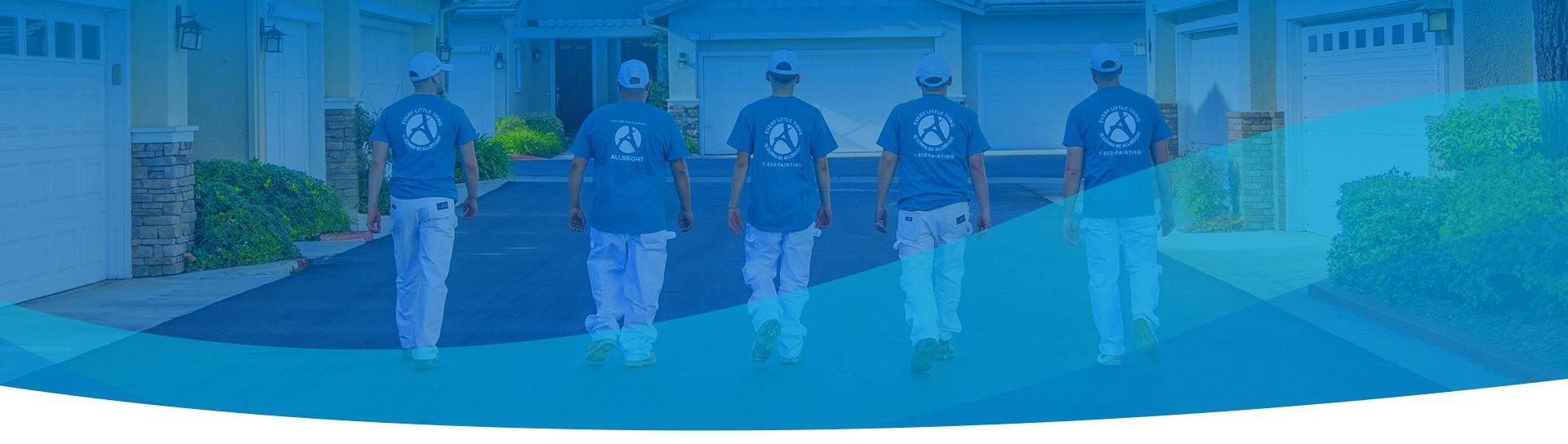
ALLBRiGHT PAINTING's Most Requested Shades
Here in the greater Los Angeles area, we get to work on so many beautiful homes with unique architectural styles. Lately, our clients have been drawn to a wonderful mix of colors. We’re seeing a lot of requests for deep, moody charcoals and rich, earthy greens that connect homes to the beautiful Southern California landscape. At the same time, warm, creamy whites and inviting beiges remain classic favorites for their timeless appeal. You can see a wide range of these stunning transformations in our portfolio. These popular choices reflect a desire for homes that feel both modern and comforting.
Deep Blues & Charcoals: Moody and Modern
If you’re looking to make a sophisticated statement, a deep, moody color is the way to go. Shades like charcoal gray, deep navy, and even near-black are incredibly popular right now for their ability to create a modern, dramatic look. A color like Behr’s ‘Cracked Pepper’ can make architectural details pop and gives a home a solid, grounded presence. These darker colors pair beautifully with natural wood accents, crisp white trim, and stone features. While it might feel like a bold move, a dark exterior can be surprisingly warm and elegant, setting your home apart from the rest.
Rich Greens & Earth Tones: Inspired by Nature
Bringing the outdoors in is a major theme in design, and that extends to home exteriors. Rich, nature-inspired hues are perfect for creating a tranquil and harmonious feel. Think of colors like deep forest green, calming sage, or warm, earthy browns. These shades help your home blend beautifully with its natural surroundings, whether you have lush landscaping or a view of the nearby hills. An earthy palette feels organic and peaceful, offering a sense of calm every time you pull into the driveway. It’s a wonderful way to make your home feel like a true retreat.
Warm Neutrals: Timeless and Inviting
After years of cool grays dominating the scene, warm neutrals are making a major comeback. Colors like creamy beige, soft taupe, and warm off-whites create a welcoming and cozy aesthetic that never goes out of style. These shades are incredibly versatile and work well on everything from Spanish-style homes to modern farmhouses. A warm neutral like Sherwin-Williams’ ‘Accessible Beige’ provides a soft, inviting backdrop that feels both classic and fresh. It’s a perfect choice if you want a color that is timeless, elegant, and makes your home feel instantly more inviting.
Classic Whites: Crisp and Clean
You can simply never go wrong with a classic white. A crisp, clean white exterior provides a timeless look that enhances curb appeal and complements any style of architecture. Shades like Benjamin Moore’s ‘White Dove’ or Sherwin-Williams’ ‘Dover White’ offer a bright, fresh appearance that makes a home look sharp and well-maintained. White is also a fantastic canvas for showcasing other features, like colorful landscaping, a bold front door, or dark window frames. Many of our exterior painting projects use a classic white to give homes a stunning, clean finish that looks great for years to come.
What's Trending in Exterior Paint?
Choosing an exterior paint color is a big commitment, but seeing what’s popular can make the decision easier. While you want a color you’ll love for years, today’s palettes are all about creating a specific mood. From bold and dramatic to calm and earthy, these trends offer beautiful ways to express your home’s personality and enhance its best features. Let’s look at what’s inspiring homeowners right now.
The Shift to Moody, Dramatic Hues
We’re seeing a confident move toward darker, more dramatic exterior colors. Think deep charcoals, rich slate blues, and even sophisticated near-blacks like Sherwin-Williams' Peppercorn. These moody hues create a stunning, modern look that makes a home feel grounded and elegant. They work especially well on homes with clean lines or mid-century architecture, providing a dramatic backdrop that makes greenery and lighter-colored trim pop. A dark exterior makes a bold statement and can give your home an immediate sense of strength and style. Our exterior painting team can help you find the perfect dramatic shade that still feels welcoming.
Nature-Inspired Palettes That Calm and Connect
On the softer side, earthy, nature-inspired colors are incredibly popular. Homeowners are drawn to palettes that create a sense of tranquility and connection to the outdoors. This includes a wide range of greens, from soft sage and olive to deep forest green, as well as warm, earthy browns. These colors are perfect for Southern California, as they harmonize beautifully with natural landscapes, from lush gardens to sun-drenched hills. Choosing a nature-inspired color can make your home feel like a peaceful retreat. You can see how we’ve used these calming colors in our portfolio of completed projects.
Two-Toned Palettes for Added Dimension
Why settle for one color when you can have two? Using a two-toned palette is a fantastic way to add dimension and highlight your home’s unique architectural features. This trend goes beyond just a contrasting trim color. It involves pairing complementary colors on different elements of the siding, like using a darker shade on the ground floor and a lighter one on the second story. This approach adds visual interest and personality without overwhelming the eye. Thoughtful color pairing is key, and a professional can help you select a combination that looks intentional and beautifully balanced.
How Color Choice Impacts Your Curb Appeal
Choosing an exterior paint color is one of the most significant decisions you’ll make for your home. It’s the first thing people see, and it sets the tone for your entire property. The right palette can highlight your home’s best architectural features, create a specific mood, and even increase its value. Whether you want to make a bold statement or create a tranquil retreat, the colors you choose are your greatest tool for transforming your home’s exterior.
Dark Colors for a Bold, Modern Look
If you’re aiming for a sophisticated and contemporary feel, dark colors are an excellent choice. Shades like deep charcoal, slate gray, and near-black create a dramatic effect that helps your home stand out with confidence. Darker shades like Black Fox and Peppercorn are especially effective on modern or mid-century style homes, giving them a grounded, substantial presence. This approach works beautifully in natural settings, allowing the home to blend with its surroundings while still making a strong statement. You can see how we’ve used these striking colors in our portfolio to create stunning results.
Light Colors for a Classic, Welcoming Vibe
Light and airy colors give your home a timeless, inviting look. Classic whites, soft grays, and pale pastels make a home feel larger, brighter, and cleaner. A color like Sherwin-Williams’ ‘Upward,’ a calm blue with gray undertones, can make a home feel peaceful and simple. These shades are perfect for reflecting the Southern California sun, keeping your home looking fresh and cool. A light exterior provides a versatile backdrop for landscaping and personal touches, ensuring your home always feels welcoming. This classic approach is a cornerstone of our residential painting services.
Earth Tones for a Grounded, Tranquil Feel
To create a seamless connection between your home and its natural surroundings, look to earth tones. Colors inspired by nature, such as sage green, warm beige, and rich browns, give your home a calm and organic feel. These palettes are incredibly popular because they are both grounding and stylish. Earthy tones are strong contenders, with greens and browns often used together in a two-toned look to add dimension. These colors harmonize beautifully with the landscapes around the San Fernando and Santa Clarita Valleys, creating a home that feels like a true sanctuary. Many of the 2024 colors of the year reflect this trend toward natural palettes.
Bright Accents to Show Off Your Personality
You don’t have to paint your entire house a bold color to make an impact. Adding a pop of color with a bright accent is a fantastic way to refresh your home’s exterior and inject some personality. Your front door is the perfect place to start. A vibrant yellow, a classic red, or a cool teal can completely change your home’s character and create a cheerful focal point. Shutters, window trim, and even mailboxes are other great spots for a splash of color. This is a low-commitment way to experiment with trends and show off your unique style.
How to Choose the Perfect Exterior Paint Color
Choosing an exterior paint color can feel like a huge commitment. After all, it’s the first thing people see, and it sets the tone for your entire home. But you don’t have to feel overwhelmed by endless paint chips. The key is to work with what you already have. By looking at your home’s permanent features and its surroundings, you can narrow down your options and find a color that feels just right. These steps will help you make a choice you’ll love for years to come.
Consider Your Home's Architecture and Fixed Features
Before you fall in love with a color, take a good look at your home’s style and its unchangeable elements. A color that works on a Spanish-style home might not suit a Mid-Century Modern design. Your home’s architecture provides a natural starting point. Pay close attention to the fixed features that aren’t getting painted, like brick or stone accents, vinyl window frames, and pathways. These materials have underlying tones (warm reds, cool grays, earthy browns) that your new paint color should complement, not fight against. The goal is to create a harmonious look where the paint enhances your home’s best features, which you can see in our portfolio of Los Angeles homes.
Factor in the Southern California Climate
Here in Southern California, the constant sunshine plays a big role in how paint looks and performs. The intense, direct light can make colors appear significantly lighter and more vibrant than they do on a small swatch indoors. A soft gray you loved in the store might look almost white on a sunny afternoon. The sun’s UV rays are also tough on paint, causing darker colors to absorb more heat and fade faster over time. That’s why choosing a high-quality, durable paint is so important. Our residential painting services always use paints designed to withstand the climate, ensuring your color stays true and your finish lasts.
Match Your Landscape, Hardscape, and Roof
Your house is part of a bigger picture that includes your yard, driveway, and especially your roof. The roof is one of the largest surfaces, and its color is a major factor in your home’s overall palette. A charcoal gray roof is versatile and works with both cool and warm colors, while a brown or terracotta tile roof will steer you toward warmer shades. Take a step back and look at everything together. Do you have lush green trees, colorful flower beds, or desert landscaping? Choosing colors that harmonize with your natural surroundings will give your home a cohesive, grounded feel that looks intentional and beautifully integrated into its environment.
Check Your Neighborhood Vibe and HOA Rules
Finally, take a look around your community. While you want your home to reflect your personal style, it’s also part of a neighborhood. See what color schemes are common on your street. You don’t need to match your neighbors, but understanding the local aesthetic can help you choose a color that fits in while still standing out. Most importantly, if you live in a community with a Homeowners Association (HOA), be sure to check their guidelines before you get too far. Many HOAs have a pre-approved list of colors to maintain a consistent look. As a team that has worked in neighborhoods all over the LA area, we understand the importance of getting it right, and we’re always happy to help you find a beautiful, compliant color.
Create Maximum Impact with Smart Color Combinations
Choosing the main color for your home’s exterior is a huge decision, but it’s only the first step. The real secret to a stunning, head-turning result lies in the combination of colors you choose for the body, trim, and accents. A well-planned color scheme works together to highlight your home’s best features, create a specific mood, and give your property a polished, cohesive look. Think of it like putting together a great outfit; every piece plays a part. By strategically selecting your supporting colors, you can transform a simple paint job into a thoughtful design statement that truly reflects your style.
Understand Light Reflectance Value (LRV)
Before you fall in love with a paint chip, it’s helpful to understand a little bit of the science behind it. Every color has a Light Reflectance Value, or LRV, which measures how much light it reflects. This number, on a scale from 0 (absolute black) to 100 (pure white), tells you how light or dark a color will appear once it’s on your walls. In sunny Southern California, LRV is especially important. Colors with a low LRV absorb more light and heat, which can make your home warmer and may cause the paint to fade faster. High-LRV colors do the opposite, reflecting light and heat to help keep things cooler. Knowing a color’s Light Reflectance Value helps you make an informed choice that’s as practical as it is beautiful.
Use Contrasting Trim to Make Features Pop
Trim is the finishing touch that makes your primary color shine. Think of it as the frame around your home’s artwork. Using a crisp white or off-white trim is a classic choice that creates sharp, clean lines and helps architectural details like windows, eaves, and door frames stand out. This contrast can make a home look incredibly polished and well-maintained. But white isn’t your only option. For a more subtle, modern aesthetic, you could pair a light body color with a slightly darker trim in the same color family. The key is to create enough contrast to define the different elements of your home’s exterior. You can see how different trim colors create unique looks in our portfolio of completed projects.
Choose Strategic Accents for Doors and Details
This is where you get to have some fun and let your personality show. An accent color is used in small doses to draw attention to specific features, like your front door, shutters, or gables. Adding a pop of color is a fantastic way to refresh your home’s exterior without committing to a bold color all over. A vibrant front door can create a charming and welcoming focal point that instantly improves your curb appeal. For a home with a neutral palette, a door painted in a deep navy, cheerful yellow, or classic red can make a beautiful statement. It’s a low-risk, high-reward design choice that adds character and makes your home uniquely yours.
How to Test Paint Colors the Right Way
You’ve narrowed down your choices, but looking at a tiny paint chip is worlds away from seeing that color across your entire home. To avoid any "what have I done?" moments, testing your top contenders is a non-negotiable step. It’s the single best way to guarantee you’ll love the final result. Proper sampling helps you see how a color truly behaves on your home’s unique surfaces and in the changing Southern California light. Think of it as a dress rehearsal for your home’s new look, ensuring the color you choose is one you’ll be happy with for years to come.
Sample Your Colors Directly on Your Home
The texture of your home’s exterior, whether it’s stucco, wood, or brick, will change how a paint color looks. The same goes for the paint’s finish (like matte or satin). That’s why it’s so important to test your paint directly on the surface where it will live. We recommend painting large swatches, at least two-by-two feet, for each color you’re considering. Don’t just paint one spot; apply samples on a wall that gets full sun and another that’s mostly in the shade. This gives you the most accurate preview of the final look and feel, ensuring your residential painting project turns out exactly as you envisioned.
Observe Samples Throughout the Day
That perfect greige you loved in the morning might look surprisingly purple by late afternoon. Light is the most influential factor in how we perceive color, and it changes constantly. Make it a point to check on your paint samples at different times: in the soft morning light, under the direct midday sun, and as the sun sets in the evening. This simple habit is crucial for spotting unwanted undertones that might only appear for a few hours a day. Seeing how the colors perform throughout the day will give you the confidence that you’ve picked a shade you’ll love 24/7. You can see beautiful examples of how light interacts with different colors in our portfolio.
Use Digital Tools (But Trust a Real-Life Test)
Paint visualizer apps are fantastic for the initial stages of color selection. Tools like the Sherwin-Williams ColorSnap® Visualizer let you upload a photo of your home and digitally "try on" different shades. They’re a great way to quickly rule out colors that just don’t work with your home’s style or fixed elements. However, a digital rendering can’t perfectly replicate how a color will look in real life. Screen brightness, resolution, and simulated lighting can be misleading. Use these tools to narrow your options, but always make your final decision based on physical paint samples painted directly on your house. Nothing beats seeing the real thing with your own eyes.
Common Mistakes to Avoid When Choosing Exterior Paint
Choosing an exterior paint color feels like a huge commitment, and it is! A great paint job lasts for years, so you want to be sure you’ll love the color just as much on year five as you do on day one. We’ve seen it all, and we want to help you avoid the common slip-ups that can lead to disappointment. By sidestepping these few mistakes, you can feel confident in your final choice.
Forgetting to Test Colors on the Actual Surface
That tiny paint chip you loved in the store can look dramatically different once it’s covering your entire house. This is one of the most common surprises for homeowners. The texture of your home’s exterior, whether it’s stucco, wood, or siding, will change how the color appears. More importantly, the bright Southern California sun will make colors look lighter and can pull out hidden undertones you didn’t notice indoors. The only way to know for sure is to test. We always recommend painting large sample swatches directly on your home, observing them in the morning, afternoon, and evening light to see how they change. This step is crucial for a successful exterior painting project.
Ignoring Fixed Elements Like Brick, Stone, or Roofing
Your home already has a built-in color palette. The fixed elements, like your roof, brick or stone accents, window trim, and even your driveway, aren’t going anywhere. These features have distinct undertones that your new paint color must harmonize with. For example, a roof that looks gray from the street might have subtle blue or brown undertones up close. Choosing a siding color that clashes with these undertones can make the whole design feel off. Before you fall in love with a color, hold the paint chip up against your roof and stonework. A well-chosen color will complement these elements, creating a cohesive and polished look you can see in our project portfolio.
Picking a Trend That Won't Last
It’s easy to get swept up in the latest color trends, but an exterior paint job is a major investment you’ll live with for a long time. While a bold, of-the-moment color might look fantastic now, ask yourself if you’ll still love it in five or seven years. Often, the wisest approach is to choose a timeless, classic color for the main body of your house. If you’re eager to show off your personality with a trendy shade, use it on your front door or shutters. These smaller accents are much easier and less expensive to repaint when you’re ready for a change. This allows you to enjoy current styles without committing your entire home to a color that might not age well.
Our Go-To Paint Brands for Quality and Color
A beautiful paint job is about more than just a great color; it’s about a finish that lasts. The quality of the paint we use is just as important as the skill of our painters. After all, a stunning exterior needs to stand up to the Southern California sun without fading, cracking, or peeling. That’s why we are incredibly selective about the products we apply to your home. Using professional-grade paint ensures better coverage, superior durability, and richer, longer-lasting color. It’s the difference between a paint job that looks good for a year and one that protects and beautifies your home for years to come.
Investing in a high-quality product from the start saves you time and money on future touch-ups and repaints. When you work with us, you can trust that we’re using only the best materials to deliver a flawless and enduring result. Our commitment to quality is part of every residential painting project we undertake, ensuring your home looks its best and is well-protected against the elements. We believe in doing the job right the first time, and that always starts with the right can of paint.
ALLBRiGHT PAINTING's Preferred Paint Lines
Over our many years of painting homes across the greater Los Angeles area, we’ve worked with countless paint brands. This experience has helped us identify the true performers, the ones that consistently deliver exceptional results for our clients. We primarily rely on industry leaders like Benjamin Moore and Sherwin-Williams. These brands have earned our trust because their products offer superior adhesion, coverage, and color retention. Their extensive and thoughtfully curated color palettes also make it easy for homeowners to find the perfect shade to match their vision. By sticking with these proven brands, we can confidently stand behind our work and promise a beautiful, long-lasting finish.
Why We Trust Brands Like Benjamin Moore & Sherwin-Williams
Our loyalty to brands like Benjamin Moore and Sherwin-Williams comes down to one word: performance. They are constantly innovating, developing paints that are more durable, easier to apply, and more vibrant than ever before. Their formulas are designed to withstand harsh weather, resist mildew, and prevent fading from UV exposure, which is essential for any home exterior. Plus, they are always at the forefront of color trends. Whether it’s a deep, modern blue like Benjamin Moore’s ‘Blue Nova’ or a calming, airy shade like Sherwin-Williams’ ‘Upward,’ they provide the options our clients are looking for. You can see the stunning results these paints deliver in our portfolio.
Considering Eco-Friendly and Low-VOC Options
We believe a beautiful home shouldn't come at the expense of your family’s health or the environment. That’s why we are happy to use eco-friendly paints with low or zero VOCs (Volatile Organic Compounds). VOCs are chemicals that can be released into the air as paint dries, contributing to air pollution and causing that strong "new paint" smell. Low-VOC and zero-VOC paints are formulated to minimize these emissions, making them a healthier choice for your family and the planet. Thankfully, top brands like Benjamin Moore and Sherwin-Williams offer fantastic eco-friendly lines that provide the same durability and beautiful color you expect, so you never have to compromise on quality.
Related Articles
- How to Pick Perfect External Wall Paint Colours
- A Pro's Guide to External Wall Paint Colours
- Exterior Paint Colors 2025: Images & Ideas
Frequently Asked Questions
Will painting my house a dark color make it hotter inside? That’s a great question, especially for us here in Southern California. Dark colors do absorb more light and heat from the sun because they have a low Light Reflectance Value (LRV). While this can make the surface of your home warmer, the impact on your interior temperature is usually minimal if your home is well-insulated. The most important factor is using a high-quality, durable paint formulated to resist fading and damage from UV rays, which ensures a dark color stays rich and beautiful for years.
How many different colors should I use on my home's exterior? A good rule of thumb is to use a three-color palette. This typically includes a primary color for the main body of the house, a secondary color for the trim around windows and eaves, and an accent color for specific details like the front door or shutters. This approach creates a balanced and polished look with enough dimension to highlight your home’s best features without looking too busy or complicated.
I’m worried about choosing a trendy color I’ll get tired of. What are some safe but stylish options? If you want a color with lasting appeal, you can’t go wrong with warm neutrals or earthy, nature-inspired tones. Shades like creamy off-whites, soft beiges, and versatile greiges provide a timeless backdrop that feels both fresh and classic. Similarly, muted greens and warm grays inspired by the natural landscape are sophisticated choices that won't feel dated in a few years. They offer style without being tied to a fleeting trend.
My house has a lot of brick or stone. How do I pick a paint color that won't clash? The key is to identify the undertones in your home's fixed features. Look closely at your brick or stone; does it have warm undertones like red, orange, or brown, or is it cooler with hints of gray, blue, or purple? Choose a paint color that shares a similar undertone. For example, a warm beige would beautifully complement reddish brick, while a cool gray would harmonize with slate-colored stone, creating a cohesive look.
Why is it so important to test paint samples if I can use a digital visualizer tool? Digital visualizers are fantastic for getting a general idea of a color scheme and quickly ruling out options you don’t like. However, the color you see on a screen can be very different from how it looks in real life. These tools can’t account for the specific texture of your home’s siding or the way Southern California’s natural light changes throughout the day. A physical paint sample is the only way to see the color’s true character and any hidden undertones before you commit.