A Gazillion Trends
I feel as though I have served my time in the design field, some 35 years now, long enough to say that I have seen a gazillion trends come and go. The point being – our role is to navigate the sea of constant suggestions and carefully discover what we personally resonate best with and determine what holds value, and why. The question of longevity of any adopted colour and style trend is subjective and based on demographics, climate, architecture, relationships and perception.
That being said, here is a peak at what I personally favour and am seeing as the main contenders for 2019, that make me pine for a little colour infusion boost into my own home, as is any trend intention.
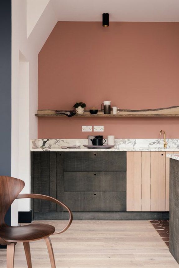
The Heart Of The Home
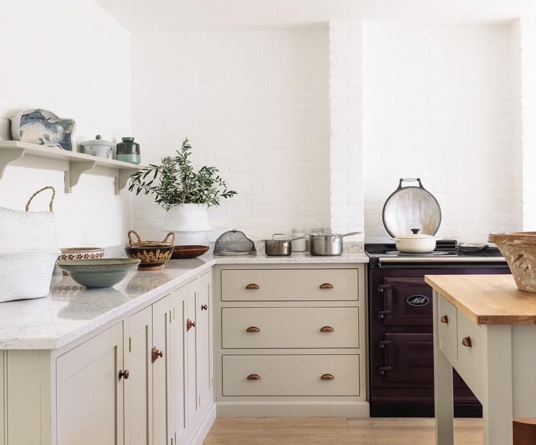
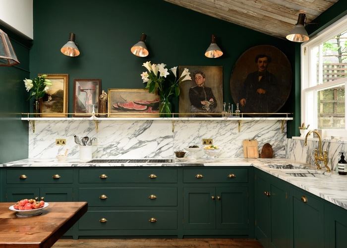
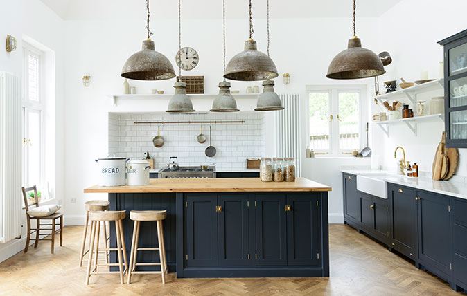
There is a major focus on making the kitchen – the heartbeat of the home, more comfortable and livable. Inspired by the current more minimal design direction.there is a focus on the functional: diverse storage ideas, multi-functional islands and the abandonment of upper bulky cabinetry runs which offer greater opportunity for open shelving and product displays – and seriously great lighting.
Walls now have more square footage thus a larger colour canvas. Contrasting colours like pink and dark green, classic navy with soft white or shades of invigorating coral which also highlight textural variation. Cabinetry colours range from bark like natural wood stains, pale blues, creamy mushrooms, to the darkest tinted blue blacks and intoxicating earthy greens.
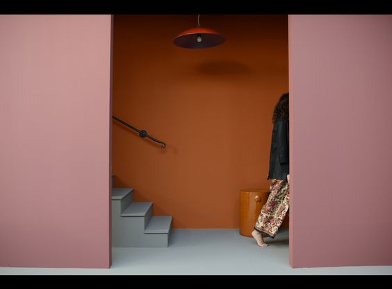
Pretty In Blush
The Blush colour family stands strong. Dirty muddied pinks are incredibly versatile and fit so many schematics – especially the Nordic-Scandi vibe, with its minimal, organic neutrals of ocean blues, soft whites and offbeat yellows. Colour blocking, with wallpaper or hand-painted geometrics in contrasting colours, is an interesting way to add edgier colour and pattern to a range of spaces – while at the same time presenting a strong and intentional style statement.

Mixed Metals
Metals can thankfully now be mixed, without fear of it being a major faux pas, adding a reflective polish to any colour palette.
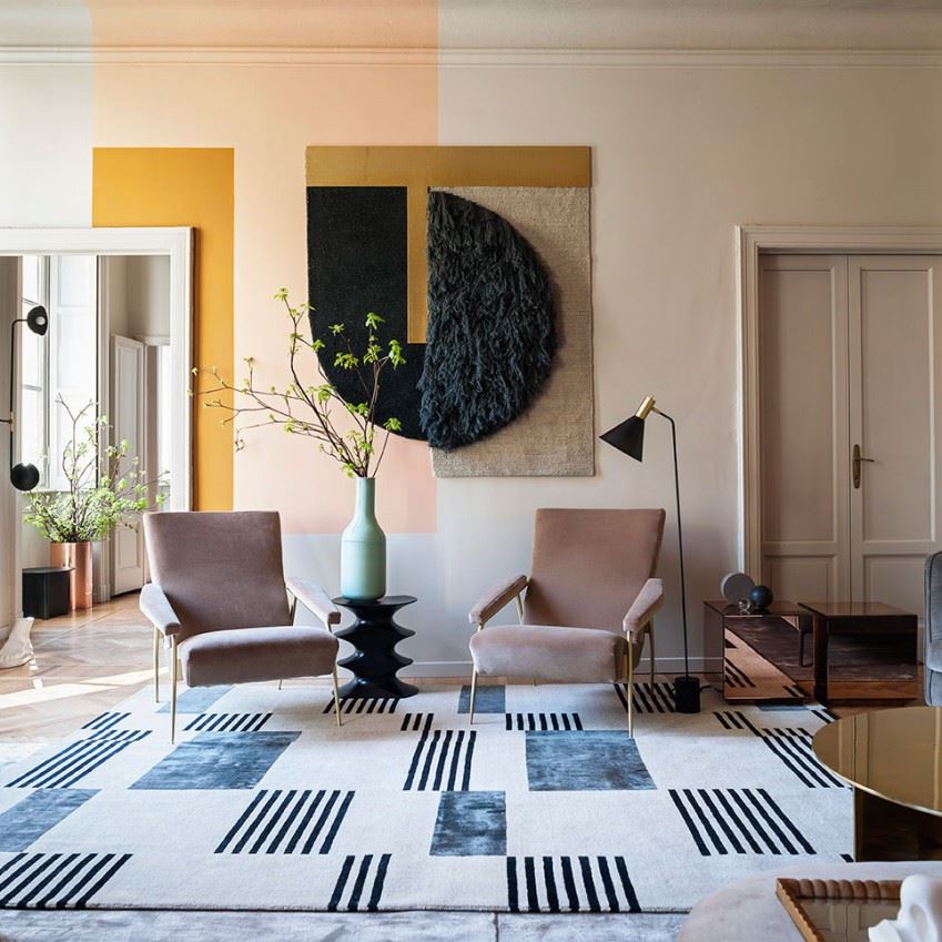
Colour Pop
Whether it’s dark and moody, light and ethereal or earthy woodland neutrals there is a call for colour, with a greater awareness that implementing the right colour palette lifts mood, raises optimism and provides a better sense of well being. Try, pink and burnt orange, slate grey also with more lilac toned pinks, or forest greens with brass accents and fresh, light and brights.
FREE Color Consultation
A new color can not only revitalize but completely change the look and feel of an entire room. Hire ALLBRiGHT 1-800-PAINTING for your next painting project in Greater Los Angeles and receive a free colour consultation.
About The Author
Philippa Radon works independently and also as a designer and color consultant for ALLBRiGHT 1-800-PAINTING
Philippa Radon Design – Los Angeles
369 S Doheny Drive, Suite 403
Beverly Hills, CA 90211