As the owner or manager of a hotel, whether large or small, you know the importance of creating a welcoming first impression for your guests. They arrive, bag in hand, tired from their miles of travel and ready for a clean, inviting space.
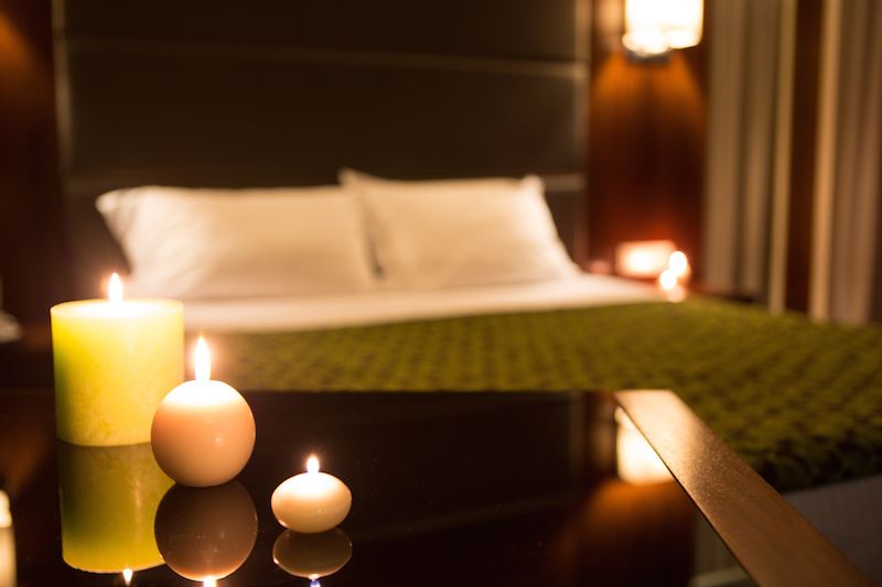
As important as the lobby and reception area is, the real deciding factor that determines how they feel about their stay is, of course, their room. After all, as anyone who has traveled knows, it’s when the door closes, you kick off your shoes, and the suitcase lands on the bed that you form those crucial opinions.
The interior paint colors you choose for these guest spaces can be a huge asset, strategically working to promote the relaxing, calming atmosphere that you want. Is your interior paint and design working for you, or against you? There is rarely neutral ground.
The Power Of Interior Paint Colors In Your Hotel
Colors impact us. The way that they interact and play with our brain is all wrapped up in a fascinating phenomenon called color psychology. This understanding of color essentially tells us that you can create specific moods and emotions through the colors you choose (we discussed that recently in regard to choosing paint for a restaurant).
So, how does this come into play in a hotel? Here are a few color selection tips to keep in mind:
- Earthy tones – Colors that are firmly rooted in the natural world have been proven to create a sense of calm. It can be easy to cross over into a darker color scheme, however, so be careful to balance deeper tones with lighter accents. Just as an example, an earthy brown would look beautiful paired with a light, creamy off-white.
- Keep “energetic colors” to a minimum – Bright reds, yellow, and orange create a feeling of excitement and energy. This might be fantastic in some cases, but in a room where the idea is to let people kickback, too much brightness can be a bad thing. Limit these colors to being used as an accent, adding a nice pop of brightness.
- Grey – This is anticipated to be one of the most popular colors of the year. It’s calm, classy, and it welcomes bright creative accents. Just be careful to not use grey exclusively as color psychology tells us that too much grey without any contrast can feel gloomy.
- What are the relaxing colors? – In addition to those earthy tones we mentioned, soft greens, blues, and purple are all positive, promoting a sense of well-being.
Do You Need A Professional, Commercial Painter?
Regardless of the specific look, ambiance, and style you have in mind, the key is to keep your colors fresh, maintained, and bright. We can help with that! The Allbright 1-800-Painting team is committed to your vision, and will happily get behind the project you have in mind. Please contact us with any questions you have about our hotel painting services!